After getting our superpixel benchmark published in CVIU [1], I also wanted to make the results more accessible. To this end, I intended to provide interactive plots of the newly introduced metrics — namely Average Miss Rate (AMR), Average Undersegmentation Error (AUE) and Average Unexplained Variation (AUV) — as well as a gallery of qualitative results. For interactive plots, I decided to use NVD3 (as I did for the results from my bachelor thesis, too). To make the qualitative results available, I chose Unite Gallery.
Both the interactive plots and the gallery can be found online; the source code is available on GitHub:
Quantitative Results Qualitative Results GitHub RepositoryInteractive Multi-Bar Plots with NVD3
Based on the multi-bar chart example provided with the latest version of NVD3, the necessary JavaScript for the interactive plots is simple and shown below. The result in illustrated in Figure 1.
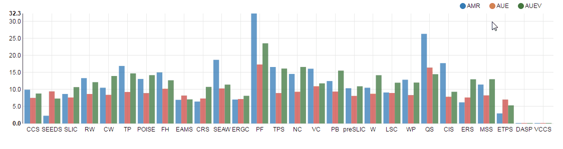
Figure 1 (click to enlarge): GIF animation illustrating the interactive plots corresponding to the code below.
var width = $('.container').attr('width');
var height = 300;
var data = [/* ... */]

// Set the appropriate height.
// #bsds500-plot is an empty svg element.
$('#bsds500-plot').attr('height', height + 'px')

nv.addGraph({
    generate: function() {
        var chart = nv.models.multiBarChart()
            .width(width)
            .height(height)
            .stacked(false)
            .showControls(false)
            .reduceXTicks(false)
            .color(['#337ab7', '#ce4844', '#3c763d']);
        var svg = d3.select('#bsds500-plot').datum(data);
        svg.transition().duration(0).call(chart);
        return chart;
    },
    callback: function(graph) {
        nv.utils.windowResize(function() {
        graph.width(width).height(height);
        d3.select('#bsds500-plot svg')
            .attr('width', width)
            .attr('height', height)
            .transition().duration(0)
            .call(graph);
        });
        // http://stackoverflow.com/questions/13136964/how-can-i-position-rotated-x-axis-labels-on-column-chart-using-nvd3
        var xTicks = d3.select('#bsds500-plot .nv-x.nv-axis > g').selectAll('g');
        xTicks
            .selectAll('text')
            .attr('transform', function(d, i, j) {
                return 'translate (-10, 25) rotate(-90 0,0)';
            });
    }
});
The required data format can be found in bar_chart.html in the GitHub repository. Here, I extended the original example only by rotating the labels as discussed here.
Tiles using Unite Gallery
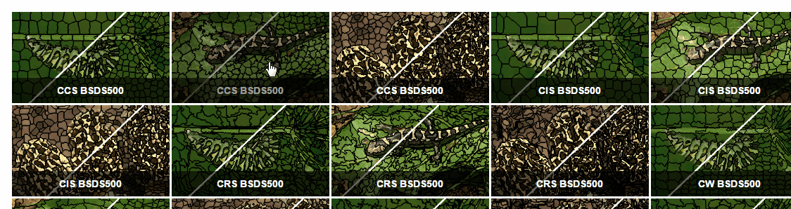
Figure 2 (click to enlarge): GIF animation illustrating the gallery showing qualitative results.
The qualitative results are displayed as tiles using the basic column tiles example. The underlying HTML looks as follows:
<div id="summary-tiles">
    <img alt="CCS BSDS500" src="https://davidstutz.de/wordpress/wp-content/uploads/2017/04/ccs_35028_contours.png" data-image="https://davidstutz.de/wordpress/wp-content/uploads/2017/04/ccs_35028_contours.png" height="50" width="100" style="display:none">
    <img alt="CIS BSDS500" src="https://davidstutz.de/wordpress/wp-content/uploads/2017/04/cis_35028_contours.png" data-image="https://davidstutz.de/wordpress/wp-content/uploads/2017/04/cis_35028_contours.png" height="50" width="100" style="display:none">
    <img alt="CRS BSDS500" src="https://davidstutz.de/wordpress/wp-content/uploads/2017/04/crs_35028_contours.png" data-image="https://davidstutz.de/wordpress/wp-content/uploads/2017/04/crs_35028_contours.png" height="50" width="100" style="display:none">
    <!-- ... -->
</div>
The corresponding JavaScript is a simple call to the Unite Gallery:
$('#summary-tiles').unitegallery({
    tile_enable_textpanel :true,
    tile_textpanel_title_text_align: 'center',
    tile_textpanel_always_on: true,
    tiles_col_width: '21',
});
The result is illustrated in Figure 2.
- [1] David Stutz, Alexander Hermans, Bastian Leibe. Superpixels: An Evaluation of the State-of-the-Art. CoRR abs/1612.01601 (2016).